Best Neutral Paint Colors for Living Rooms
“`html
Best Neutral Paint Colors for Living Rooms: A Complete Guide
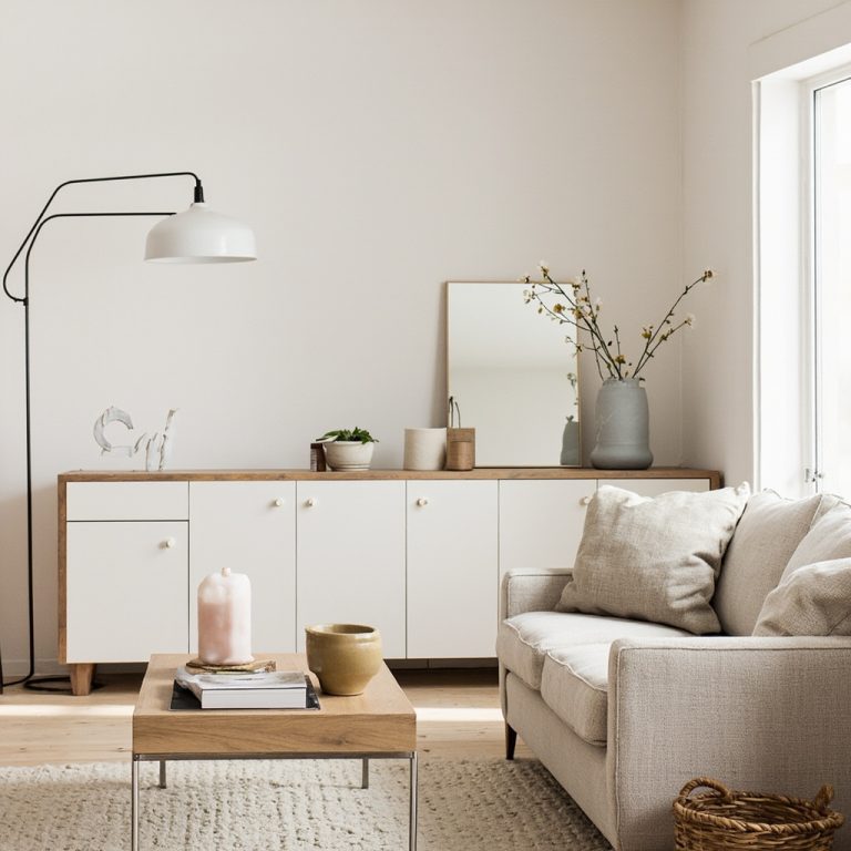
Choosing the right paint color for your living room can feel overwhelming, especially when you’re standing in front of hundreds of neutral options. Yet neutrals remain the most popular choice for living spaces—and for good reason. They create a calming backdrop, work with almost any décor style, and provide flexibility for seasonal updates without a complete overhaul.
At Nest Decored, we understand that finding the perfect neutral isn’t about picking white and calling it a day. The best neutral paint colors have depth, character, and the ability to transform your space while maintaining timeless appeal. In this guide, we’ll explore the neutrals that work best in living rooms and share practical tips for choosing the right one for your home.
Why Neutral Colors Work for Living Rooms
Neutral paint colors are more than just safe choices—they’re strategic design decisions. A well-selected neutral serves as a canvas for your furniture, artwork, and accessories, allowing these elements to shine. Neutrals also create a sense of tranquility, making your living room feel like a true sanctuary after a long day.
Beyond aesthetics, neutrals offer practical benefits. They make spaces feel larger, work with changing décor trends, and appeal to a broader range of tastes if you’re planning to sell your home. Most importantly, neutral colors hide dust and minor imperfections better than bold hues, reducing the visual maintenance burden.
Top Neutral Paint Colors for Living Rooms
Warm Whites and Off-Whites
Pure white can feel sterile in a living room, which is why warm whites have become increasingly popular. Colors like ivory, cream, and warm white contain subtle undertones of yellow, beige, or pink that create a welcoming atmosphere.
When selecting a warm white, consider the lighting in your living room. Natural light will reveal the true undertones, while artificial lighting can shift how the color appears throughout the day. Benjamin Moore’s “Cloud White” and Sherwin-Williams’ “Alabaster” are excellent warm white options that work beautifully in both modern and traditional living rooms. These shades provide brightness without the clinical feel of pure white.
Soft Greiges
Greige—a blend of gray and beige—has dominated interior design for the past decade, and it shows no signs of fading. This sophisticated neutral combines the coolness of gray with the warmth of beige, creating a balanced color that works in virtually any living room.
Greige is particularly versatile because it adapts to both warm and cool accent colors. Pair it with warm wood tones for a cozy feel, or combine it with cooler metals and blues for a contemporary look. Sherwin-Williams’ “Accessible Beige” is a beloved greige option that designers recommend frequently. It’s warm enough to feel inviting but neutral enough to accommodate any décor style.
Soft Grays
Gray has evolved from trendy to timeless, and for good reason. Soft grays create a sophisticated, calming environment perfect for living rooms where you want to unwind. Unlike cool, industrial grays, soft gray neutrals contain warmth that prevents them from feeling cold or institutional.
Look for grays with LRV (Light Reflectance Value) between 50-70 for living rooms—this range provides enough lightness to keep the space feeling open without being too pale. Behr’s “Collonade Gray” offers this perfect balance, providing depth while maintaining airiness.
Warm Taupes
Taupe is often overlooked, but it’s an underrated neutral that brings sophistication to living spaces. Taupe combines the warmth of brown with the coolness of gray, creating a neutral that feels both grounded and serene.
Warm taupes work especially well in living rooms with significant natural wood elements. They complement exposed beams, wooden shelving, and hardwood floors beautifully, creating a cohesive, intentional look. This color family is ideal if you want something neutral but with more personality than standard gray or beige.
Subtle Beiges with Warm Undertones
Don’t dismiss beige as boring—the right beige can be absolutely beautiful. Modern beiges have moved away from flat, one-dimensional tones toward sophisticated options with subtle undertones of brown, gray, or even taupe.
Beige is particularly effective in living rooms because it naturally complements various wood tones and creates a warm, welcoming environment. Farrow & Ball’s “String” is a premium option that offers unexpected depth while maintaining neutral appeal.
Practical Tips for Choosing Your Neutral
Test Before You Commit
Always purchase sample pots of paint before committing to full gallons. Paint large swatches (at least 2×3 feet) on your living room walls and observe them at different times of day. Natural light in the morning, afternoon, and evening will reveal how the color truly performs in your space.
Consider Your Existing Elements
Before selecting a neutral, identify the permanent fixtures in your living room—flooring, trim color, and built-in elements. Your paint color should complement these existing features. If you have warm-toned wood floors, gravitate toward warmer neutrals. Cool-toned tile or carpet pairs better with grays and cooler greiges.
Account for Lighting
Artificial lighting significantly impacts how paint colors appear. If your living room relies on warm incandescent or amber LED bulbs, cool grays might appear warmer than expected. Conversely, bright white LED lighting can make warm neutrals appear more yellow. When possible, view samples under the actual lighting conditions you’ll use most.
Think About Undertones
Every neutral has undertones—subtle hues that become apparent when you look closely. Identify whether your chosen neutral leans warm (yellow, red, or orange undertones) or cool (blue, green, or purple undertones). Your undertone choice should complement your décor style and other colors in your home.
Finishing Touches
Once you’ve selected your neutral paint color, enhance your living room with complementary elements. Textured throw pillows, layered lighting, and artwork add visual interest against a neutral backdrop. Plants bring life to neutral spaces, while books and decorative objects introduce color and personality without overwhelming the calm backdrop your paint color provides.
Conclusion
The best neutral paint color for your living room depends on your specific space, lighting conditions, and personal style preferences. Whether you choose a warm white, sophisticated greige, soft gray, or warm taupe, remember that neutral doesn’t mean bland. These colors provide the perfect foundation for a living room that feels both timeless and personal. Take time to test samples, consider your lighting and existing elements, and don’t be afraid to choose a neutral with character. Your living room will thank you with a space that feels like home for years to come.
“`
Frequently Asked Questions
What defines a ‘neutral’ paint color for a living room?
Neutral colors are those without strong hues, such as whites, off-whites, grays, and beiges. They provide a versatile and calming backdrop, allowing furniture and decor to shine without competing for attention.
Why should I choose a neutral paint color for my living room?
Neutrals create a serene, spacious, and sophisticated atmosphere. They offer flexibility for decorating, easily accommodating changes in style or accessories, and appealing to a broad range of tastes for a timeless look.
How do I pick the right neutral paint color for my specific living room?
Consider your room’s natural light exposure, existing furnishings, and desired mood. Test samples on different walls to observe how the color appears throughout the day, as undertones can shift with varying light conditions.