The Psychology Of Color In Home Design: What Each Room Needs
When it comes to decorating your home, the right colors can make all the difference between a cozy retreat and a sterile space. Colors have the power to evoke emotions, stimulate mood, and even influence behavior – making them an essential element in any home design. In this article, we’ll delve into the psychology of color and provide expert recommendations for each room in your home.
Blue is often considered a soothing color that promotes relaxation and serenity. It’s no wonder why blue has been a popular choice for bedrooms, bathrooms, and living rooms. Look for calming shades like:
* Sherwin-Williams’ “Sea Salt” (SW 6204) in a soft, pale blue
* Valspar’s “Driftwood Blue” (5013-3A) in a weathered, grey-blue finish
* Benjamin Moore’s “Palladian Blue” (2062-60) in a gentle, cerulean hue
Materials: Choose from plush area rugs, linen bedding, and crisp white walls to create a peaceful atmosphere.
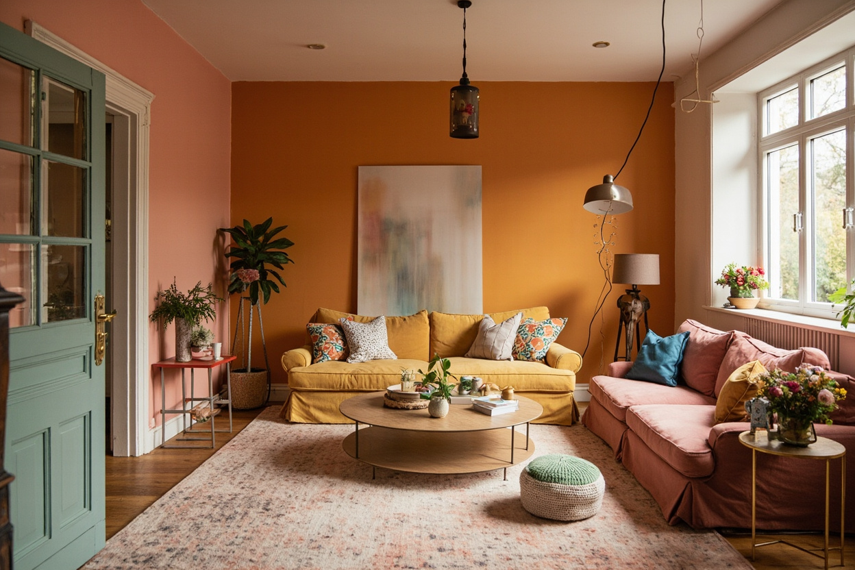
Contrary to popular belief, red is not just a bold, attention-grabbing color. It can actually stimulate energy, passion, and excitement. Use it in:
* Accent furniture pieces, like a bold red armchair
* Kitchen accessories, such as a red ceramic tile backsplash or a bright red kitchen faucet
* Throw pillows and blankets to add a pop of color
Materials: Look for rich, warm-toned materials like terracotta pottery, leather upholstery, and fiery-hued wood furniture.
Nature is full of soothing greens that can create a sense of balance and harmony. From soft sage to radiant lime, here are some expert picks:
* Sherwin-Williams’ “Rainwashed” (SW 6204) in a gentle, pale green
* Valspar’s “Fresh Mint” (5013-B12) in a soft, pastel shade
* Benjamin Moore’s “Sage Trail” (2154-40) in a muted, mossy hue
Materials: Choose from natural textiles like linen bedding, jute rugs, and woven baskets to bring the outdoors in.
Yellow is more than just a bright, sunny color – it’s also linked to happiness, optimism, and warmth. Use it to create a lively atmosphere:
* Sunny yellow accents on throw pillows, blankets, or a statement wall
* Bright yellow kitchen accessories, like a yellow ceramic vase or a sunny-yellow kitchen faucet
* Yellow-toned natural fiber rugs or woven baskets
Materials: Look for vibrant, cheerful materials like woven baskets, bright yellow ceramics, and optimistic-hued glassware.
Purple is often associated with creativity, luxury, and wisdom. While it may not be the first color that comes to mind when decorating a home, purple can add sophistication and elegance:
* Rich plum tones for accent furniture pieces or statement walls
* Soft lavender shades for bedding and linens
* Deep berry hues for kitchen accessories or decorative accents
Materials: Choose from luxurious materials like velvet upholstery, rich textiles, and sumptuous rugs.
When incorporating the psychology of color into your home design:
* Balance bold colors with neutral
Related Guide: For more on this topic, see our Dark Academia Room Decor guide.
Related: The Psychology Of Color In Home Design: What Each Room Needs
Related: The Psychology Of Color In Home Design: What Each Room Needs
Related: The Psychology Of Color In Home Design: What Each Room Needs
Related: The Psychology Of Color In Home Design: What Each Room Needs
Related: The Psychology Of Color In Home Design: What Each Room Needs
Related: The Psychology Of Color In Home Design: What Each Room Needs
Related: The Psychology Of Color In Home Design: What Each Room Needs
Related: The Psychology Of Color In Home Design: What Each Room Needs
Related: The Psychology Of Color In Home Design: What Each Room Needs
Related: The Psychology Of Color In Home Design: What Each Room Needs