The Psychology Of Color In Home Design: What Each Room Needs
**Embracing the Psyche of Color: A Guide to Creating a Harmonious Home**
When it comes to designing a home, the right colors can make all the difference between a cozy retreat and a sterile space. The psychology of color plays a significant role in creating a sense of warmth, comfort, and inviting atmosphere in your home. In this article, we’ll delve into the world of color psychology and provide expert recommendations on what each room needs to create a harmonious and aspirational interior.
**The Color Wheel: A Masterclass in Harmony**
Understanding the color wheel is crucial when designing a space that exudes warmth and coziness. The color wheel is a fundamental tool in home decorating, as it helps you identify complementary colors that work well together. Here’s a breakdown of the color wheel:
* **Warm Colors** (red, orange, yellow): evoke feelings of energy, excitement, and warmth.
* **Cool Colors** (blue, green, purple): promote relaxation, calmness, and serenity.
For a cozy living room, focus on warm colors like terracotta, caramel, or golden brown. These earthy tones will create a welcoming atmosphere, perfect for snuggling up with a good book.
In the kitchen, opt for cool colors like sky blue, seafoam green, or frosty purple to stimulate creativity and inspire new ideas.
**Aspirational Bedrooms: Soft Blues and Whites**
A bedroom is an intimate space where you retreat to recharge. To create a relaxing oasis, focus on soft blues and whites that promote serenity and calmness. Here are some expert recommendations:
* **Soft Blue:** Sherwin-Williams’ “Sea Salt” (SW 6204) or Valspar’s “Driftwood Grey” (5013-3A)
* **White:** Benjamin Moore’s “Snowfall White” (2152-10) or Behr’s “Soft Chamois” (142-C3)
These soft blues and whites will create a soothing atmosphere, perfect for a restful night’s sleep.
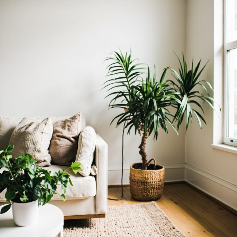
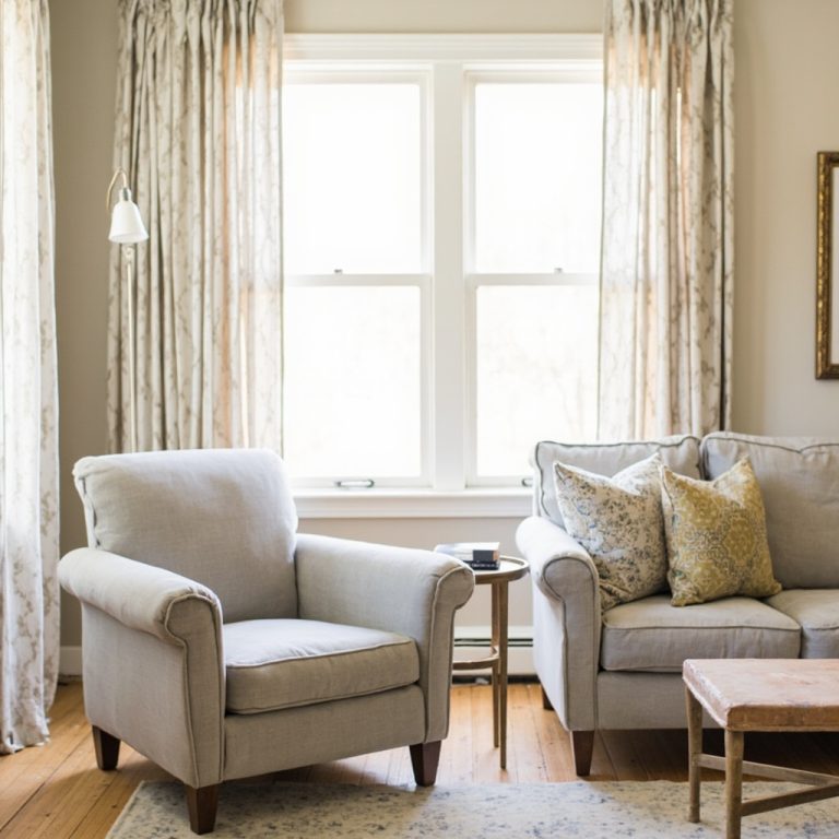
**Living Rooms: Earthy Tones and Rich Woods**
A living room is the heart of your home, where social gatherings unfold. To create a warm and inviting space, focus on earthy tones like terracotta, sienna, or walnut. These rich colors will stimulate conversation and foster connections with family and friends.
In addition to warm colors, incorporating natural textures like woven baskets, jute rugs, and reclaimed wood furniture will add depth and warmth to your living room.
**Bathrooms: Calming Neutrals and Soft Pastels**
A bathroom is a sanctuary where self-care reigns supreme. To create a peaceful retreat, focus on calming neutrals like soft grey, cream, or pale blue. These soothing colors will promote relaxation and tranquility.
Soft pastels like lavender or mint green can add a touch of whimsy to your bathroom while maintaining a sense of calmness.
**Practical Tips for Choosing Colors**
When it comes to selecting colors, remember the 60-30-10 rule:
* **60%**: Use a dominant color (warm or cool) as the primary shade.
* **30%**: Introduce a secondary color to add depth and interest.
* **10%**: Add an accent color for extra flair.
**Where to Find Your Perfect Color Palette**
For inspiration, explore online resources like:
* Houzz: A comprehensive platform featuring stunning home design ideas.
* Pinterest