How to Mix Wood Tones in a Room Without It Looking Like a Lumber Yard
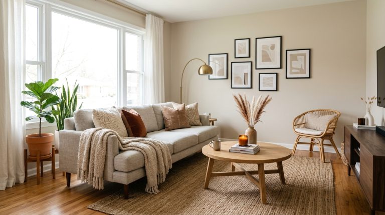
My living room used to look like a confused lumberyard exploded in it. Seriously. We had inherited my grandmother’s beautiful antique cherry wood dresser, which I loved, but then I also had a hand-me-down IKEA pine bookshelf, a cheap espresso particle board TV stand we bought years ago, and a light oak coffee table that just… appeared one day. Every single piece of wood was a different color, and the overall effect was chaotic and cheap, even with a few nice pieces mixed in. I tried painting some of the smaller pieces, but then I just had painted wood and still a mess of different wood tones. I thought I had to get rid of everything and start fresh, which wasn’t in the budget, until I figured out a few key principles.
Affiliate Disclosure: As an Amazon Associate, we earn from qualifying purchases. This means we may earn a small commission when you click our links and make a purchase on Amazon. This comes at no extra cost to you and helps support our site.
Identify Your Dominant Wood Tone
The first thing I did was look at my existing furniture and pick out the wood piece I liked the most or that was the largest and hardest to replace. For me, it was that cherry dresser. It’s a gorgeous, deep reddish-brown wood. This became my dominant wood tone. Everything else needed to either complement it or contrast it intentionally, not just clash with it. This doesn’t mean every other piece has to match exactly; that would be too much and make the room feel flat. Instead, it gives you a starting point. If your biggest piece is a light oak dining table, that’s your starting point. If it’s a dark walnut bed frame, work from there.
Think in Threes (Warm, Cool, Neutral)
Once I identified my dominant cherry (a warm, reddish tone), I realized I needed to introduce other tones that either picked up on that warmth or offered a cool contrast to keep things interesting. A good rule of thumb I stumbled upon is to aim for no more than three distinct wood tones in a single room, and make sure they fall into warm, cool, or neutral categories. My cherry dresser was warm. I then looked for something cooler. I ended up getting rid of the cheap espresso TV stand (it was falling apart anyway) and found a mid-tone, slightly grayish-brown oak console on Facebook Marketplace for $80. It wasn’t exactly cool, but it wasn’t overly warm either, providing a good bridge. For my third tone, I decided to go really light. I swapped out the IKEA pine bookshelf (which, honestly, looked out of place with everything) for a much airier metal and light birch shelf from Target, the Threshold designed with Studio McGee Etagere Bookcase, which was on sale for $120. The birch wood on it is very pale and almost acts as a neutral, letting the cherry and the medium oak stand out. Now I had a deep warm cherry, a medium neutral oak, and a very light, almost white birch. It felt balanced.
Incorporate Non-Wood Elements to Break It Up
This is crucial. You don’t want every single surface to be wood. It’s too much. Once I had my three wood tones, I consciously brought in other materials to break up the wooden surfaces. I added a woven jute rug under the coffee table for about $50 from West Elm, which introduced texture without competing with the wood palette. I placed a metal side table next to the sofa—a simple black steel frame with a glass top—which cost around $70. The glass and metal gave the room visual breathing room. I also hung floating shelves in matte black metal ($35 for a set of three from Amazon) above the dresser, which creates clean lines that contrast with the organic grain of the wood below. A ceramic table lamp with a white linen shade ($45 from HomeGoods) adds another non-wood material. Even small things like a woven basket under the console, a concrete planter, or a glass vase filled with branches helps. These elements don’t have to cost much; the point is to interrupt the wood with other textures and materials so the room doesn’t feel like a timber showroom.
Layer in Complementary Colors Through Textiles and Decor
Once the wood tones were settled, I used textiles and accessories to tie everything together without adding more competing wood. I chose a color palette of warm grays and soft sage green to echo the undertones in my woods while keeping the room cohesive. I threw a chunky knit throw in warm gray over the sofa, added two throw pillows in linen (one in sage, one in cream) for about $60 total, and hung a gallery wall with prints in black frames. The sage green connected subtly to the cooler notes in the grayish-brown oak, while the warm gray echoed the warmth of the cherry without matching it exactly. This way, the room felt intentional rather than accidentally mismatched. Every wood tone now had a visual ally in the rest of the room’s palette.
Test Before You Commit
I didn’t go buy everything at once. I brought the Facebook Marketplace console home first and lived with it for two weeks before deciding it worked. I borrowed the Target bookcase from a friend who had the same one, and we did a test run in my space. This matters because lighting changes how wood looks—what seems like a perfect match in the store might read differently under your actual lamps and windows. After testing, I felt confident making the bigger investments, and there were no surprises once I committed.
The total spent was maybe $330 in new pieces—mostly replacements for things that were already falling apart—plus some affordable textiles and accessories. The room went from looking like a furniture mismatch to feeling like a deliberately curated space. The key wasn’t getting rid of everything or spending a fortune; it was being intentional about the tones I kept and then building everything else around that choice.
Instant digital download — print at home or at your local print shop
Frequently Asked Questions
What’s the best approach to start mixing wood tones in a room?
Begin by selecting one dominant wood tone for larger pieces. Then, introduce one or two secondary tones that share similar undertones (warm, cool) or varying levels of lightness/darkness to create a cohesive yet dynamic look.
How can I prevent my room from looking like a mismatched ‘lumber yard’?
Focus on common undertones and vary the darkness/lightness, not just the species. Incorporate non-wood elements like rugs, upholstery, or painted furniture to provide visual breaks and prevent wood overload, ensuring intentionality.
Should I use woods with similar grain patterns or different ones?
Mixing different grain patterns adds visual interest and texture, preventing a flat look. Just ensure the overall color family or undertone remains consistent, or use a neutral element to bridge differences.
Instant download — no subscription needed
Similar Posts
The $200 Living Room Refresh That Actually Looked Expensive
Okay, so my living room was basically a brown box. Brown couch, brown rug, beige walls. It was fine, but it felt… heavy. Like it was sucking the light right out of the room. And honestly, after staring at the same setup for three years, I was ready for a change without, you know, selling…
Best Bedside Table Lamps for Reading
Okay, so your bedroom is pretty much a sanctuary, right? Except, maybe after a long day, you get into bed with your favorite book or your phone to scroll, and suddenly, you’re squinting. Or maybe your current lamp has a shade so wide it’s practically illuminating the whole house, not just your page. Been there!…